
Time Frame
8 Weeks
Role
UX Researcher, Product Designer
Deliverables:
UX Research
Product Design
Branding
Self-initiated
2025
Problem:
Many runners rely on music to boost motivation, match their pace, and make runs more enjoyable. But finding the right songs is often a challenge. Pre-made playlists can’t adapt to changing speeds, moods, or goals, leaving gaps between what runners need and what they hear.
Solution:
ampd connects live fitness data with music streaming platforms to deliver real-time, personalized music experiences that adapt to each runner's performance and goals, keeping them engaged and motivated.

Process:
Every design decision in ampd traces back to one question: how do we give runners the right music without breaking the rhythm they're already in? Here's how the research led me there.
Discover :
Understanding how
runners actually use music
Before designing anything, I needed to understand what runners actually reach for mid-run, and why. A competitive analysis of existing running and music apps surfaced a consistent blind spot: no platform combines music, pace, and emotion into one experience. Music is treated as a static background playlist, never adapting to how the run is actually going.
To test whether that gap mattered, I interviewed 12 runners across a range of experience levels — and their answers pointed the same way:
The pattern underneath these quotes: runners already use music to regulate effort and emotion — they just do it manually, and imperfectly. They swap playlists, hunt for the right song mid-stride, and settle for pre-made mixes that can't keep up with a changing pace. The need wasn't for more music. It was for music that could adapt on its own.
That insight raised the question that shaped everything after it →
DEFINE :
From scattered signals
to one clear direction
Synthesizing the interviews, a set of consistent themes emerged:
Variety matters. Repetitive playlists kill motivation; runners want freshness without losing the familiar songs they rely on.
Music does two jobs at once — physical (matching cadence) and emotional (decompressing, getting into flow).
Different runners, different needs. Casual joggers want tempo that matches their pace; performance runners often want music as steady background while they pace themselves.
The demand is for adaptivity — playlists tied to pace and goals, not a fixed set-it-and-forget-it mix.
The tension across all of these: runners want music that supports their effort without dictating it. Push too hard and the app fights the runner's internal rhythm; do too little and it's just another playlist. That framed the guiding question for the design phase:
With that question set, the design work became about answering it structurally →
Develop :
Designing for rhythm,
not just for features
I opted for a hybrid information architecture: functional groupings for the things runners set up once (goals, preferences, onboarding) paired with page-specific placements for the things they touch mid-run (live music control, pace feedback). The result keeps deliberate setup separate from in-the-moment interaction, so nothing demanding sits between the runner and their stride.

Deliver :
Translating all the findings
into something tangible
Mid-fidelity wireframes
Getting the flow right before the polish
I started in mid-fidelity to test the structure without the distraction of visual design. The priority was the paths runners would actually take: onboarding, setting a weekly goal, and getting into a run quickly. Keeping these grayscale kept the focus on whether the flow made sense.


DESIGN SYSTEM
A reusable system built to stay legible
Typography — A single typeface, Poppins, carries the product, using weight and scale to build hierarchy rather than multiple families.
Color — Primary actions were checked for accessible contrast so key data stays readable outdoors.
Icons — A custom, single-weight set with outline and filled states, purpose-built for the running context — pace, route, heart rate, cadence, timer, music — so selection reads without labels.
Components — Buttons across a three-level hierarchy, form fields, social sign-in, selection patterns, and a goal-based dropdown — each defined once with its full range of states, then reused across the product. Defining states up front is what turns a set of screens into an actual system.

High fidelity wireframes
The adaptive experience, realized
In high fidelity, the concept becomes tangible: playlists sort by BPM range, the weekly goal shapes what's recommended, and each run's "peak moment" surfaces the track that carried it. The music stops being a background layer and becomes a readout of the run itself.

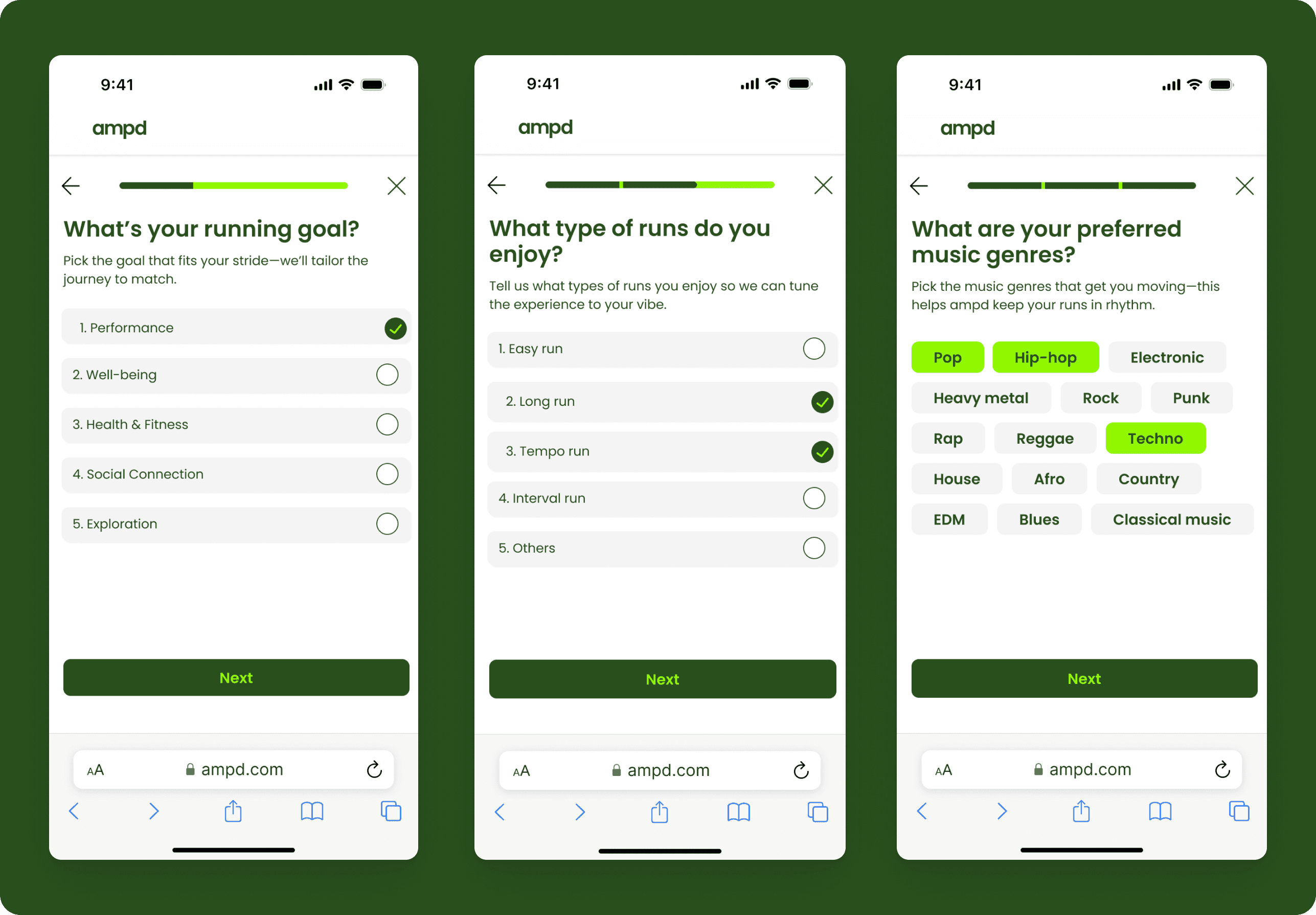


(WIP Screens)
Usability Testing
I ran usability testing across four flows — homepage, onboarding, weekly goal, and past activities — to confirm the task flow felt intuitive, evaluate onboarding, and assess the UI. The findings clustered into three themes:
General UI — Larger font sizes and stronger contrast for legibility in motion; a clearer information hierarchy in the activities feed to surface key metrics; a redesigned weekly goal card.
Content & logic — Stack the value propositions instead of hiding them in a carousel; add captions explaining running goals and types; clarify the multi-select onboarding questions.
Product function — Make the music experience more prominent; auto-curate playlists based on the user's weekly goal; add search and filter to the activity feed.
Iteration
Each finding drove a specific iteration, screen by screen:


LEARNINGS :
What research changed. I went in assuming higher BPM equals faster pace — so the app should just match music tempo to speed. The interviews dismantled that. Runners don't share one formula; they have different training goals and music habits, and the same song that pushes one into focus pulls another out of it. That reshaped the core idea: ampd couldn't just sync tempo to pace, it had to adapt to why someone runs and how they use music to get there. Letting research overrule my own starting point is what I'm carrying into every project since.
The technical constraint. ampd depends on connecting live fitness data to existing music libraries — Apple Music or Spotify — and that integration is the real hurdle between concept and product. Streaming APIs limit what a third party can control over track selection and real-time playback, so a working version would mean designing within those boundaries. I designed the adaptive experience; building it would start with what the platforms actually allow.
