
Time Frame
8 Weeks
Role
UX Researcher, Product Designer
Deliverables:
Self-initiated
2026
Problem:
Pet owners manage their pets' health across paper records, clinic-specific apps, emails, chat histories, and memory. This fragmentation leads to missed vaccinations, lost medical records, repeated tests, and unnecessary stress — especially when switching clinics, traveling, or handling emergencies.
On the other side, vet clinics operate in siloed systems with limited digital integration, making it difficult to offer continuity of care outside of in-person visits. And when pet owners turn to online sources for guidance, they're met with conflicting, overwhelming, or untrustworthy advice.
Solution:
Petly streamlines pet care to drive trust and engagement, creating an ecosystem that centralizes daily care routines, vet service, medical records, and community knowledge into one intuitive mobile platform.

Process:
Every design decision in Petly traces back to one question: how do we reduce the mental load of pet healthcare management without oversimplifying the things that matter? Here's how the research led me there.
Discover :
Understanding how
pet owners manage care
I started with a competitive analysis of existing pet care apps, including Pawp and PetDesk, to understand how pet owners currently track, schedule, and make decisions about their pet's health. A consistent gap emerged: existing solutions specialize in one vertical — either vet booking, health records, or community advice — but none bring all three together into a single, integrated experience.
I also conducted user research across pet owners with varying levels of experience and pet care complexity. Their responses pointed in the same way:
The pattern underneath these findings: pet owners already care deeply about doing the right thing — they just lack a single, reliable system that supports them. The need wasn't for more apps. It was for one platform that connects the dots between daily care, medical history, vet access, and trusted knowledge.
DEFINE :
From pain points to
clear problem statements
Synthesizing the research, I framed three How Might We problem statements:
Vet discovery and trust. How might we help pet owners assess veterinary clinics beyond surface-level ratings, so they can feel confident their pet is in good hands?
Fragmented health data. How might we create a single, reliable source of truth for a pet's health history that is easy to access, understand, and share?
Lack of trusted knowledge. How might we create a trusted space where pet owners can learn from both professionals and fellow owners without misinformation spreading?
The tension across all three framed the guiding principle for the design phase: Design for confidence — give pet owners a system they can trust to keep them organized, informed, and connected to the right care at the right time.
With that direction set, the design work became about structuring a product that could deliver on it →
Develop :
Structuring the product
around the tasks that matter most
I organized Petly's features into a four-tab navigation — Home, Care, Vet, and Forum — using task-based grouping. This structure kept most actions within two taps and followed familiar mobile conventions so first-time users could navigate without a learning curve. The grouping logic: Home for daily engagement, Care for health management, Vet for discovery and booking, Forum for community knowledge.

Deliver :
From AI-generated drafts to polished product
— an integrated workflow
AI-to-Figma Workflow
Instead of traditional wireframing, I used Claude to generate interactive HTML prototypes for core flows. Once the structural logic was validated, I used Claude Code with the Figma MCP integration to bring those layouts into Figma, where I layered in the full brand system: color palette, typographic hierarchy, spacing, component detailing, and the kind of polish that earns user trust. AI gave me the scaffolding; Figma is where the product found its identity. This workflow — AI for velocity, design tools for craft — is how I now approach early-stage product design.
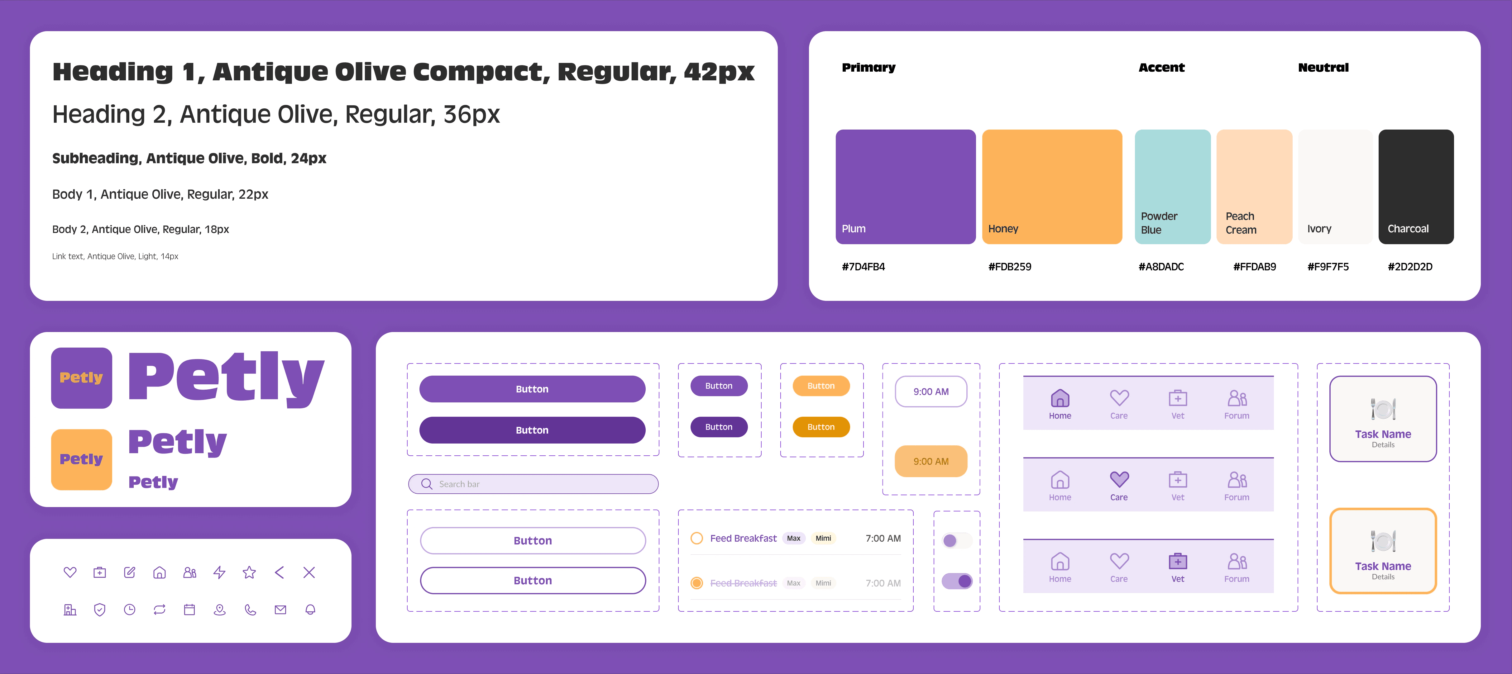
DESIGN SYSTEM
The visual identity was grounded in five core brand values — nurturing, trustworthy, friendly, insightful, and modern.
Color — A six-color palette: Plum, Honey, Powder Blue, Peach Cream, Ivory, and Charcoal. Every color pairing was audited for WCAG AA compliance across text, icons, and interactive states.
Typography — A system sans-serif for clarity and performance, with typographic weight and scale doing the work of establishing hierarchy rather than relying on decorative fonts.
Components — Routine cards with task chips, date-strip sidebars using color to encode time proximity, borderless inline rows for daily care tasks, and a floating action button for quick entry points — all built on the accessible color token system.
High fidelity Screens
The homepage surfaces today's care tasks at a glance in a calendar view. The Care page holds routine cards and health records. The Vet tab lets owners search by pet-specific criteria rather than generic ratings. Every screen applies the full brand palette and component system.


(WIP Screens)
Usability Testing
I built a test plan with quantitative targets for both core flows — task completion rate, time on task, error rate — and a full moderator script. Moderated testing produced findings across four severity levels:
Critical — Users couldn't find a routine entry point on the homepage — a fundamental discoverability failure.
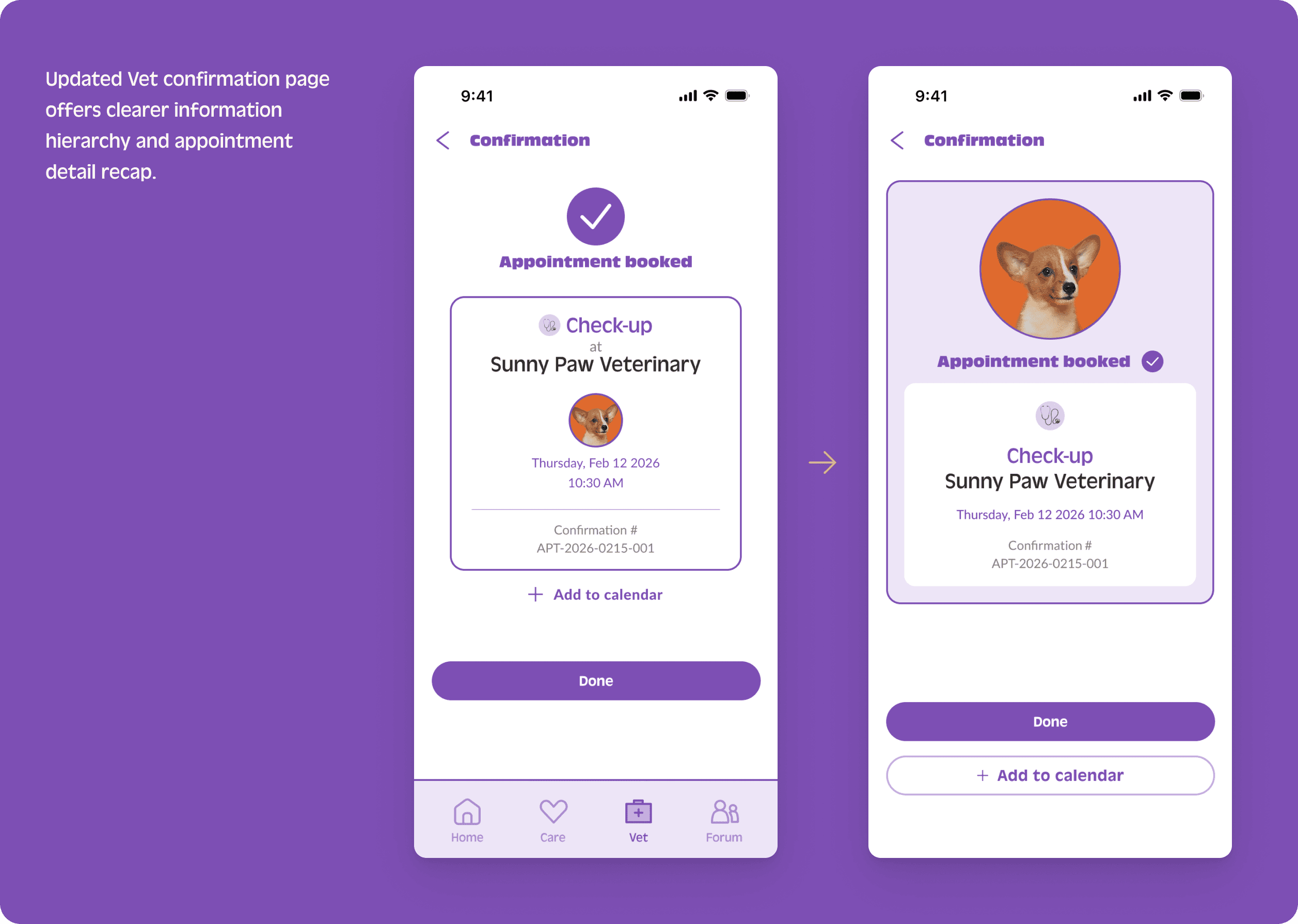
High — "Reminders" appeared as both a notification toggle and a homepage section label, creating confusion. Users also expected an appointment recap before confirming a booking.
Medium — Calendar integration labels were ambiguous.
Positive — The routine setup flow was intuitive once found. Vet booking required no prompting.
Iteration
Each finding drove a specific iteration, screen by screen:


LEARNINGS :
AI changed my process mid-project. When I started Petly, I was using AI primarily for brainstorming and copy. By the end, I was generating interactive prototypes in Claude, bridging them into Figma, and iterating on layout logic faster than any wireframing tool would allow. The tooling evolved while the project was in motion, and I evolved with it — learning when to lean on AI for speed and when to pull the work into Figma where brand judgment, visual polish, and interaction feel require a designer's hand.
