
Time Frame
4 Weeks
Role
UX Researcher, Product Designer
Deliverables:
UX Research
Product Design
Client Project
2026
Background:
Dance fitness app for a real client
When Brazily Fitness Inc. came to our team, they had an active membership base, a working web platform, and a clear ambition: bring their dance fitness community into a native mobile app with gamification and a stronger sense of community.
The real challenge was that the existing product had structural problems underneath the surface that a new app alone couldn't fix. Working with a real founder meant navigating the gap between what a client believes the problem is and what research reveals it to be. We used AI in our workflow throughout, not as a shortcut, but as a way to move with more rigor than the timeline would otherwise have allowed.

Discover :
Research-first approach to validate client assumptions
Our competitive analysis of Zumba and Shine revealed a gap neither had filled: a community-first experience with functional game mechanics and cohort capabilities. The user interviews pushed us further. Not one participant described being motivated by competition. The engine wasn't rivalry — it was belonging.
DEFINE :
Designing the foundation the product always needed
The mobile app design engagement aims to give consumers a clear, motivated, and intuitive path into Brazily Fitness’ wellness platform. The project addresses core usability failures in the current web experience (including a broken freemium conversion pathway, no onboarding flow, and an unclear information architecture) by designing a native iOS app that guides users from first launch through content discovery and ongoing engagement.

Develop :
Four core flows, wireframed end-to-end
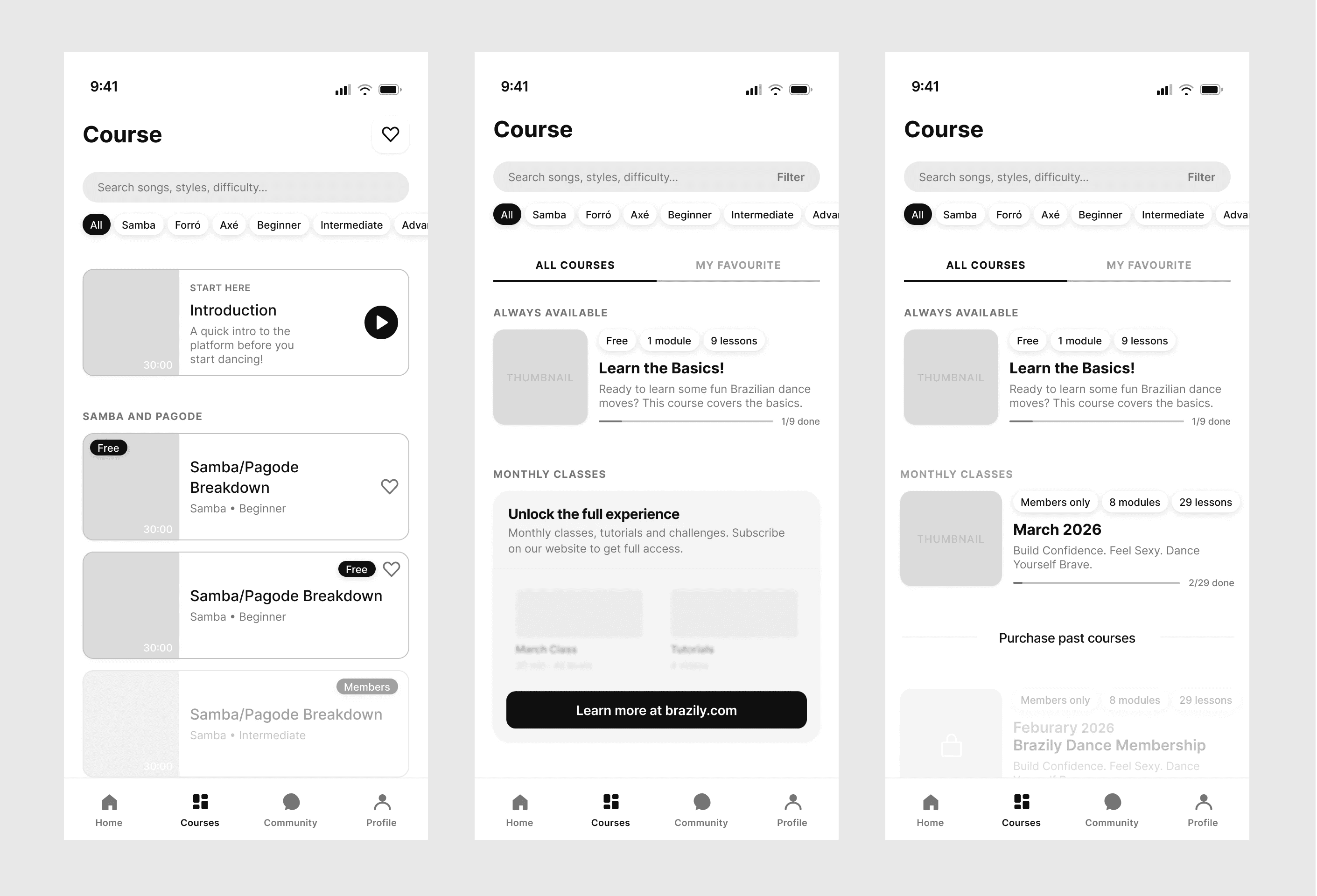
We designed mid-fidelity wireframes for Onboarding, Dashboard, Courses, and Community, staying in grayscale until the IA was validated.
The Courses tab went through the most structural revision — rebuilding it around monthly membership bundles rather than individual videos was the right call, but it exposed a perception problem only testing would reveal: locked past months made the page feel restrictive before users had read a single label. The fix was collapsing past months into a single expandable section, a small structural change with a meaningful perceptual impact.
Deliver :
Brand energy met accessible, intentional design
Building the color system from Brazily's four brand colors was where the technical and the creative had to work together without compromise. Three of Brazily's four brand colors failed accessibility standards as text on white. The hardest was yellow — #ffe600 sits at 1.3:1 contrast, nearly invisible as text, but carries the most brand warmth. The solution was a bounded role: yellow stays as decorative fill, XP bar, and streak indicator, while a derived dark gold (#997a00) handles yellow-toned text. The final system defined semantic roles across every color with all key pairings WCAG-verified — transforming a mood board into a working design system.

Iterated through testing, refined every screen
Testing surfaced friction points spanning three different problem types: architecture, perception, and mental model conflicts. The most instructive finding wasn't one we fixed — it was one we defended. Users expected membership management buried in settings because every other app puts it there. We had deliberately surfaced it at the top of the Profile tab. The testing confirmed hesitation, but not failure. The right call was a label refinement, not a relocation — and knowing the difference between a redesign and a refinement is a judgment that only develops in real conditions.


LEARNINGS :
Working with a real client is categorically different from working with a brief. The moments of misalignment, the need to advocate for users while maintaining a relationship, the discipline of documenting decisions so a founder without a design background can follow the reasoning — those are skills that only develop in real conditions. AI in the workflow didn't give us shortcuts. It gave us time to think.
